“Kaiser Permanente’s overhauled website and app put an array of new features and thoughtful user experience at the fingertips of its more than 12 million members. … Since the redesigned digital tools were introduced, Kaiser Permanente says online appointment booking rose 80% for the year, site visits more than doubled year over year, and member satisfaction with the digital experience rose from 86% to 92% after being unchanged for five years.“
Designing the future
of healthcare for the nation’s
leading HMO provider
Members expected an easily accessible self-service healthcare experience, a polar opposite to Kaiser’s phone/visit approach. Kaiser saw the opportunity — to redesign their digital brand and services from the ground up.
I helped Kaiser arrive at the next-generation experience: a simpler, mobile-first, cross-channel experience that puts health access back in the hands of their patients.
Brief
Role
User Experience Team Lead
Team Size
6, Interdisciplinary, led by me
20+ Stakeholders
Timeline
1+ Year
Context
As UX Design Team Lead for SF design agency Redshift, I was the team lead for six UX and visual designers, researchers, and engineers to envision and build Kaiser’s next generation of patient care across their mobile, desktop, and physical experiences. We worked alongside Kaiser’s in-house team, leading the effort while acting as mentors to provide a successful design process model for the company to adapt into its own.
Impact & Results
Mobile App Redesign
- 40% average increase in task completion from added consistency and parity across mobile, desktop, and physical channels – members could pick up the app and find their way more easily
- Increased design team prototyping speed by 3x after analyzing, selecting, and mentoring the team on prototyping platforms and approaches
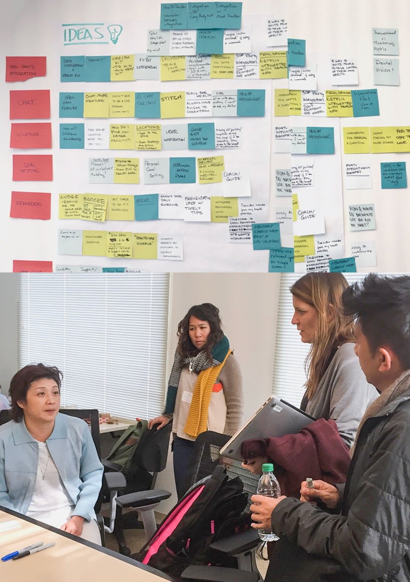
- Defined & designed 4 product differentiators with mobile best-practices and facilitated ideation sessions, including the “quick-access” home screen and meaningful personalization
Mobile & Desktop Website Redesign
- 75% increase of time-to-completion of our core task flow from our continuous rapid iteration sprint and testing strategy
- 15 user research studies conducted with over 488 individuals across 14 weeks
- 20+ Kaiser stakeholder group mentored, managed and collaborated with headquarter leads and decentralized regional teams.
- 100% accessibility assessment score from Kaiser’s wide-spectrum requirements, critical for their 12M+ members
Below is a public-friendly collection of my work on the project. A full case study is available on request.
Process: Rapid Design Sprints
Principles
We defined our core principles across the board for all projects, derived from KP’s brand values, our user research, and our UX best practices. For each project, we placed emphasis on specific items relative to the platform, channels, and user goals.
Solution Samples
Kaiser Mobile App: Design Evolution
We created multiple approaches, generating interactive prototypes for each. These prototypes were tested in concept and usability studies directly on a mobile phone, allowing us to evaluate each approach on structuring, navigation, affordances, color, and typography.
In the weeks that our team iterated and tested rapidly, my guidance on prototyping and audit of 7 different platforms allowed us to achieve our accelerated 5-day sprint times. We created a total of 11 high-fidelity interactive prototypes, achieving early stakeholder buy-in for ambitious motion design, transitions, visual design, and interaction patterns.
KP.org Website: Mobile & Desktop Parity
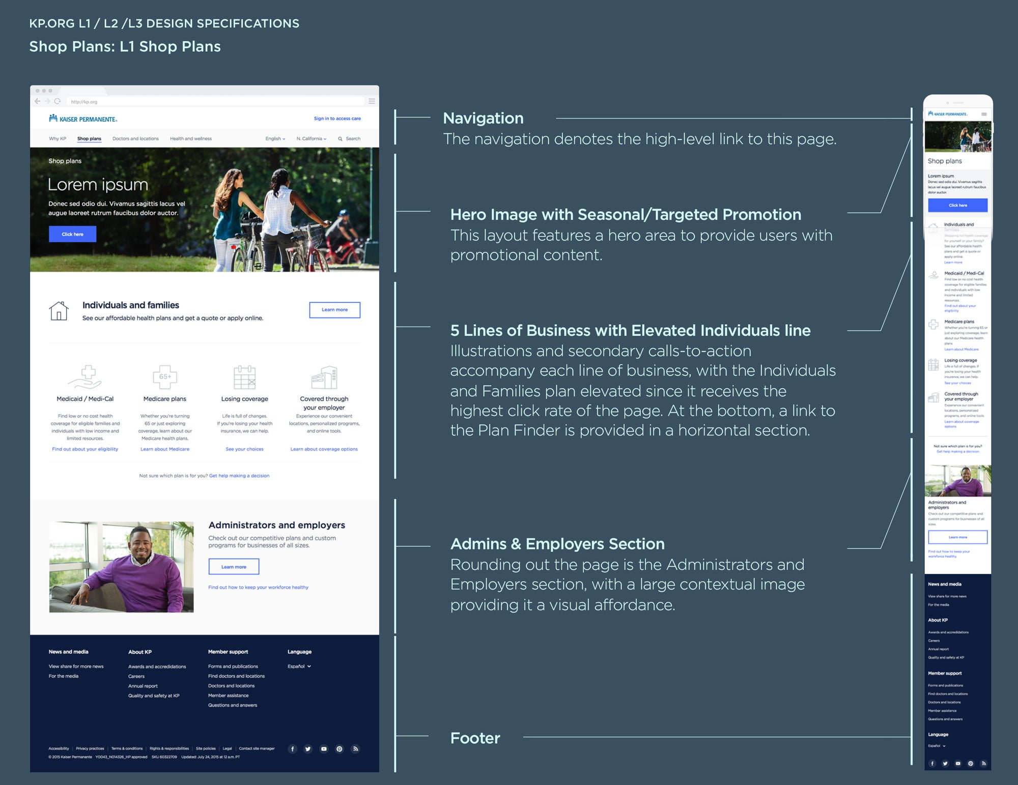
The new website for public and member-access unifies Kaiser’s multiple visual brands, defines a voice for copy and photography, and connects to our research that pinpoints how and why each page is used by both potential and current members.
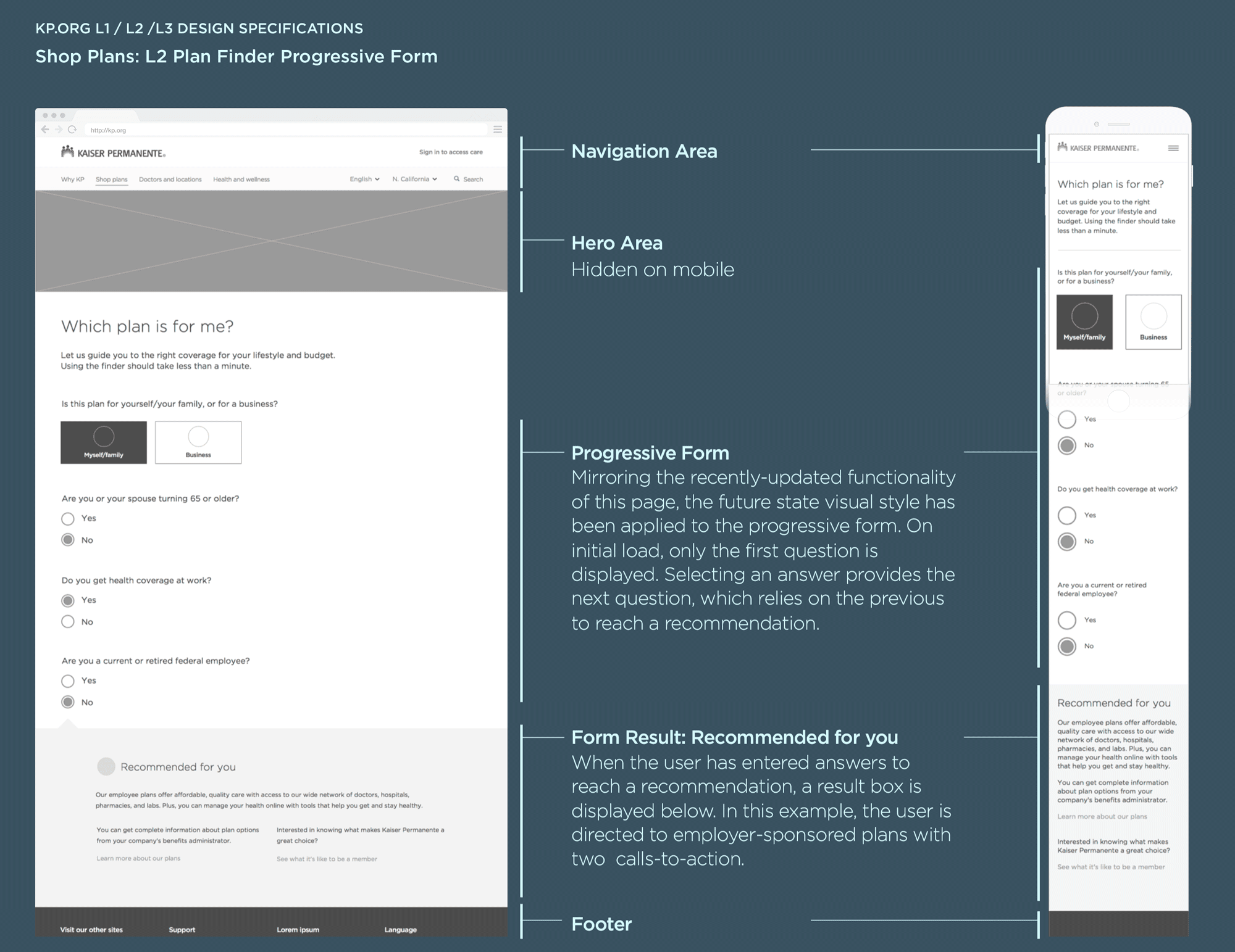
KP.org Website Spec Deliverables
Our final specification deck was 60+ pages, featuring detailed breakdowns of IA, content strategy, copy/voice recommendations, progressive form behavior, mobile/desktop responsive layout, and followup usability study suggestions.


